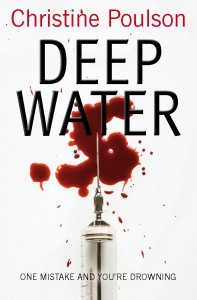
Judging a book by its cover
 It is always a slightly anxious moment when your publisher sends you the cover for your new book and asks for your comments. But when I saw the cover for Deep Water a couple of weeks ago, all I could say was ‘Wow!’ It’s simple, elegant, and striking. The novel begins with a death in a clinical trial so the image couldn’t be more appropriate. And I love the strap line, too.
It’s so important what your book wears to go out into the world. First impressions do count when someone is browsing in a bookshop or on-line. Publisher have the final say and sometimes they chose something that they think will sell even if it doesn’t reflect the content of the book. That’s not fair on author or reader. It happened to my friend Sue (over at SueHepworth.com) whose publishers picked a pink and frilly chick-lit cover for Zuzu’s Petals, her comedy of middle-aged love and loss. It wasn’t appropriate and she hated it.
I have been lucky on the whole with my covers – I especially liked the US editions of Murder is Academic and Stage Fright – but I really think this is the best so far.
Deep Water will be published by Lion Fiction in October in the UK and in January in the US.
8 Comments
moira @ClothesInBooks
May 6, 2016That’s a seriously striking cover!
Christine Poulson
May 6, 2016Thanks! I am so pleased with it.
tracybham
May 7, 2016Definitely a cover that is going to grab one’s attention. And I do like it when the cover reflects the content.
Christine Poulson
May 7, 2016Thanks, Tracy. Yes, I love it when a book cover captures the feel of a novel.
Sue
May 8, 2016I would look twice at this cover. It’s an attention grabber and an invitation to pick it up and read the blurb.
Look forward to reading it…
Christine Poulson
May 8, 2016Thanks, Sue. I’m glad you feel this.
Martin Edwards
May 11, 2016I agree. An excellent cover.
Christine Poulson
May 12, 2016Thanks, Martin!